Served as primary brand steward across all visual communications
Translated complex clinical information into accessible, trust-building assets
Improved website performance through design, structure, and SEO-aligned content
Supported patient acquisition, engagement, and retention through strategic creative
Increased efficiency of design workflows to support growth
Constraints
Healthcare Sensitivity: Required high trust, clarity, and emotional sensitivity for addiction-related content. Needed adherence to accessibility and healthcare communication best practices.
Cross-Functional Demands: Worked directly with founders, clinicians, and marketing — balancing scientific accuracy with brand tone.
Growth Environment: High output expectations in a fast-moving startup. Needed scalable templates and systems rather than one-off designs.
Platform-Specific Requirements: Designed for varied channels: investor decks, website, TikTok, paid ads, and print.
Strategy
Established and reinforced brand standards across all external-facing materials
Developed clear visual hierarchy systems to translate clinical data into digestible insights
Redesigned website structure with conversion-focused landing pages and scalable UI components
Designed campaign visuals tailored to platform behavior (e.g., TikTok-native creative)
Introduced automation and AI-assisted workflows to increase creative output and efficiency
Solution
Brand Stewardship:
Maintained and evolved visual identity across marketing, executive, and product-adjacent materials
Ensured brand consistency and accessibility compliance
Data Visualization & Education
Translated clinical and operational data into infographics and educational content
Designed materials that built credibility with both patients and investors
Website Redesign & Optimization
Led website redesign integrating UI guidelines and SEO-informed educational content
Built high-conversion landing pages and scalable design templates
Growth Marketing Support
Created TikTok ad creative and paid campaign visuals
Designed investor decks and presentation materials
Workflow Optimization
Implemented AI-assisted tools and automation to improve creative throughput
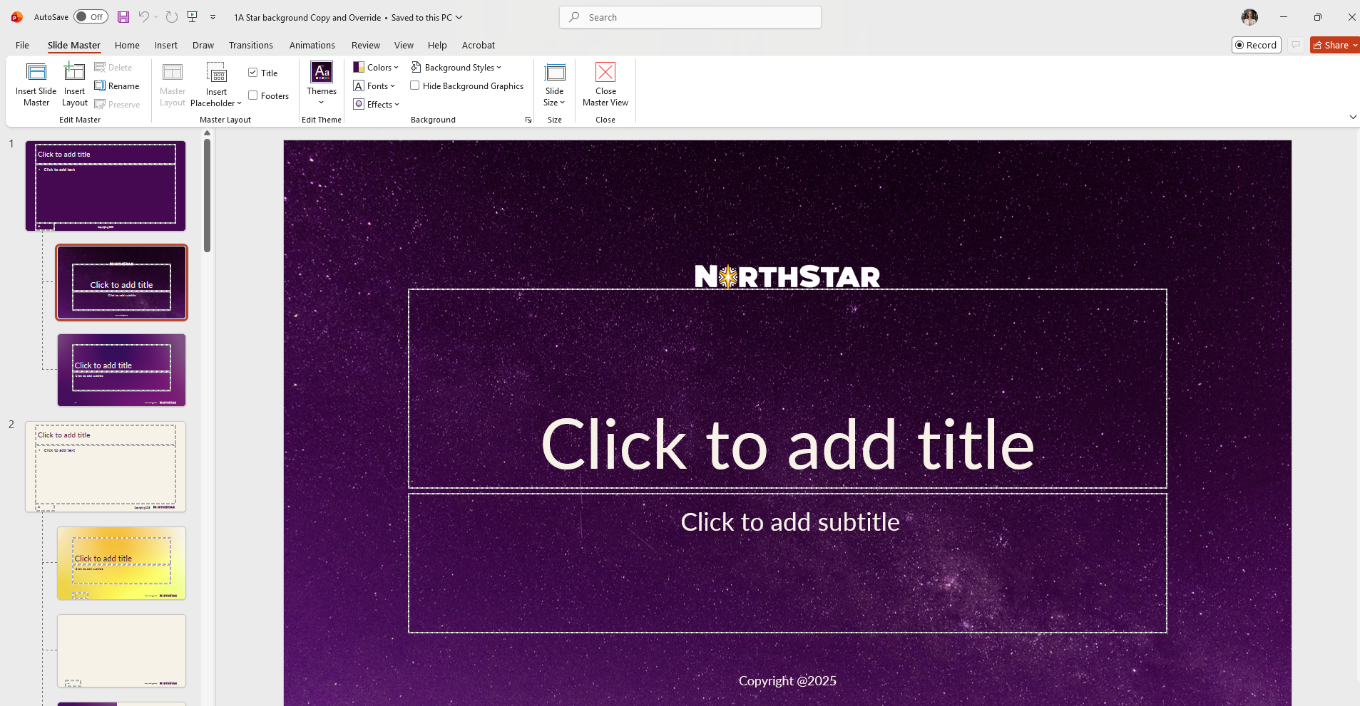
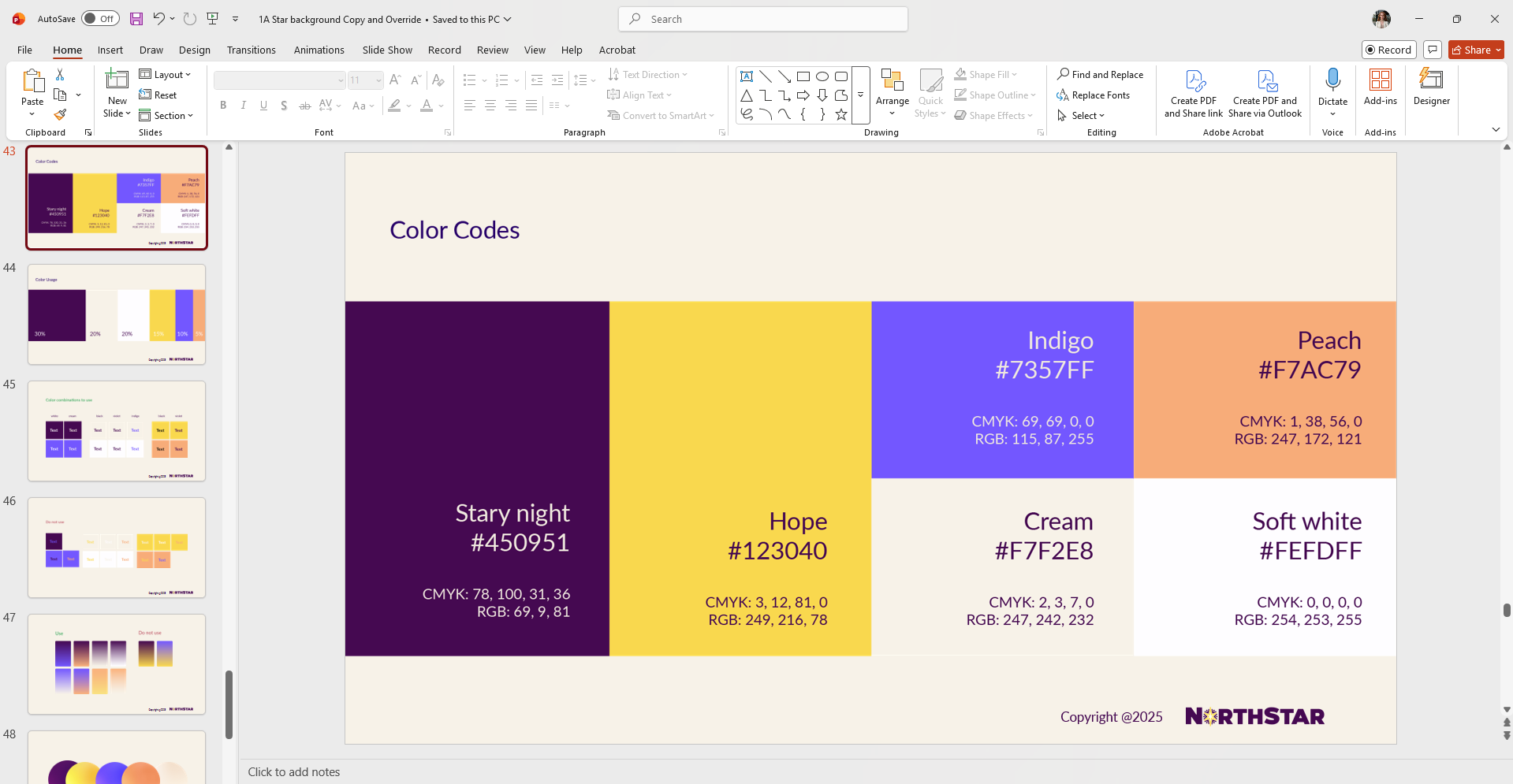
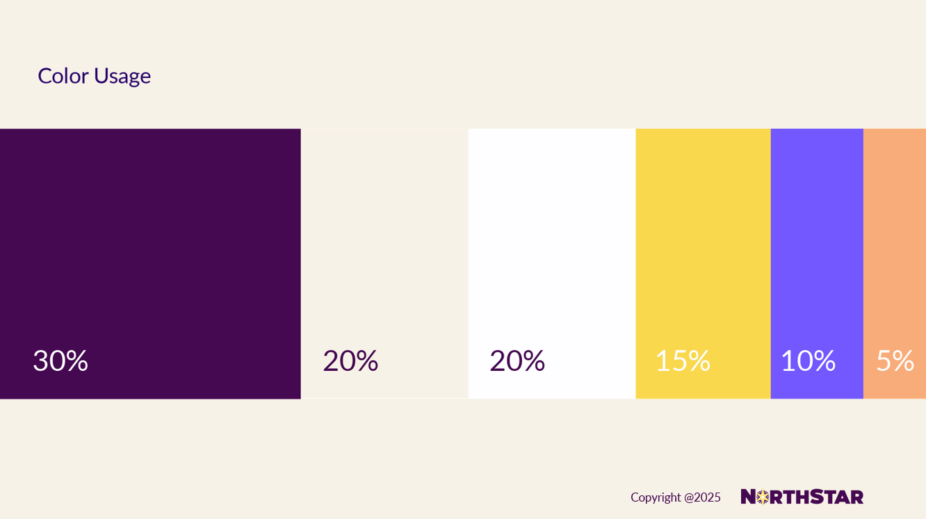
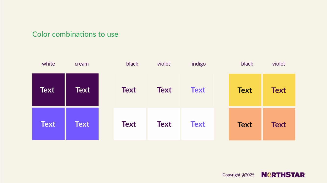
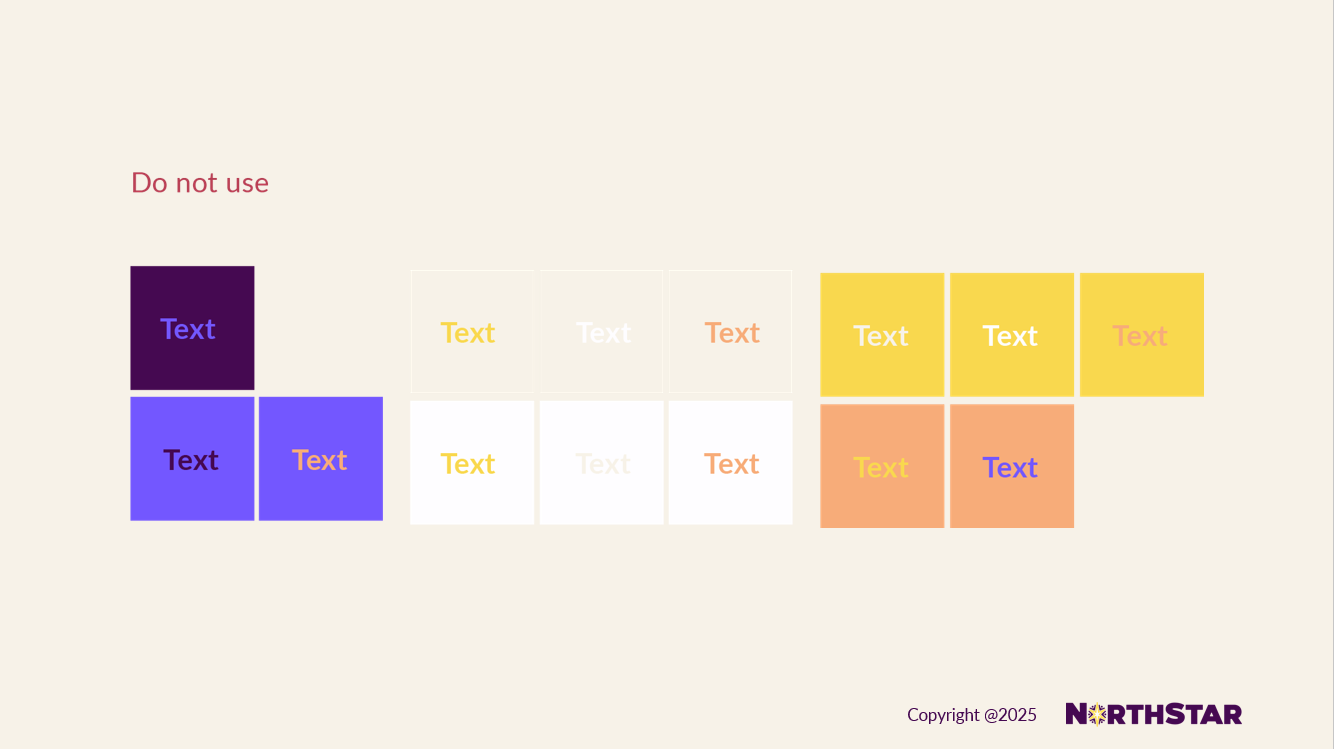
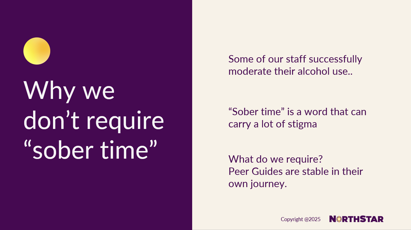
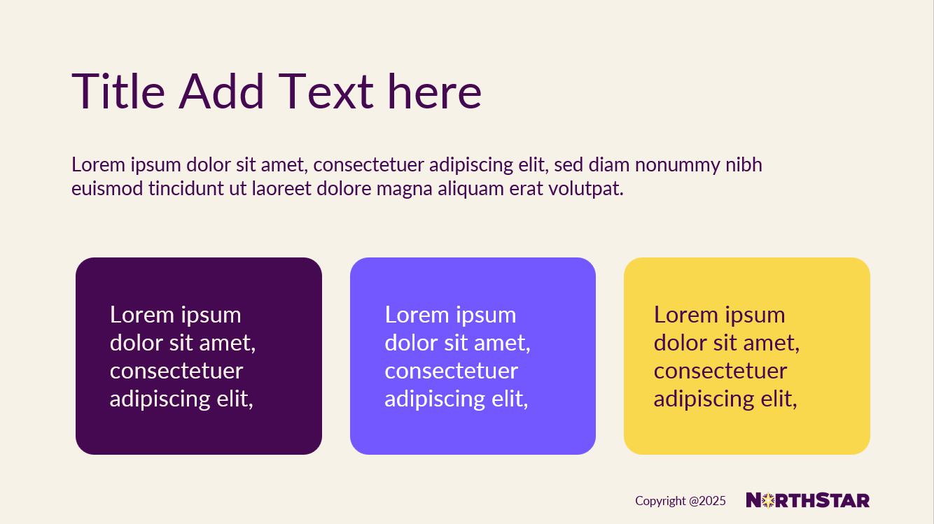
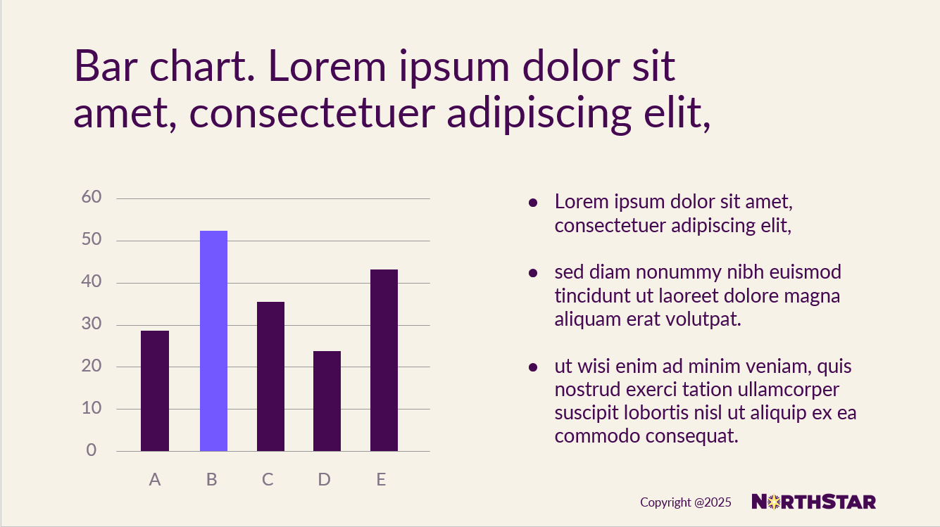
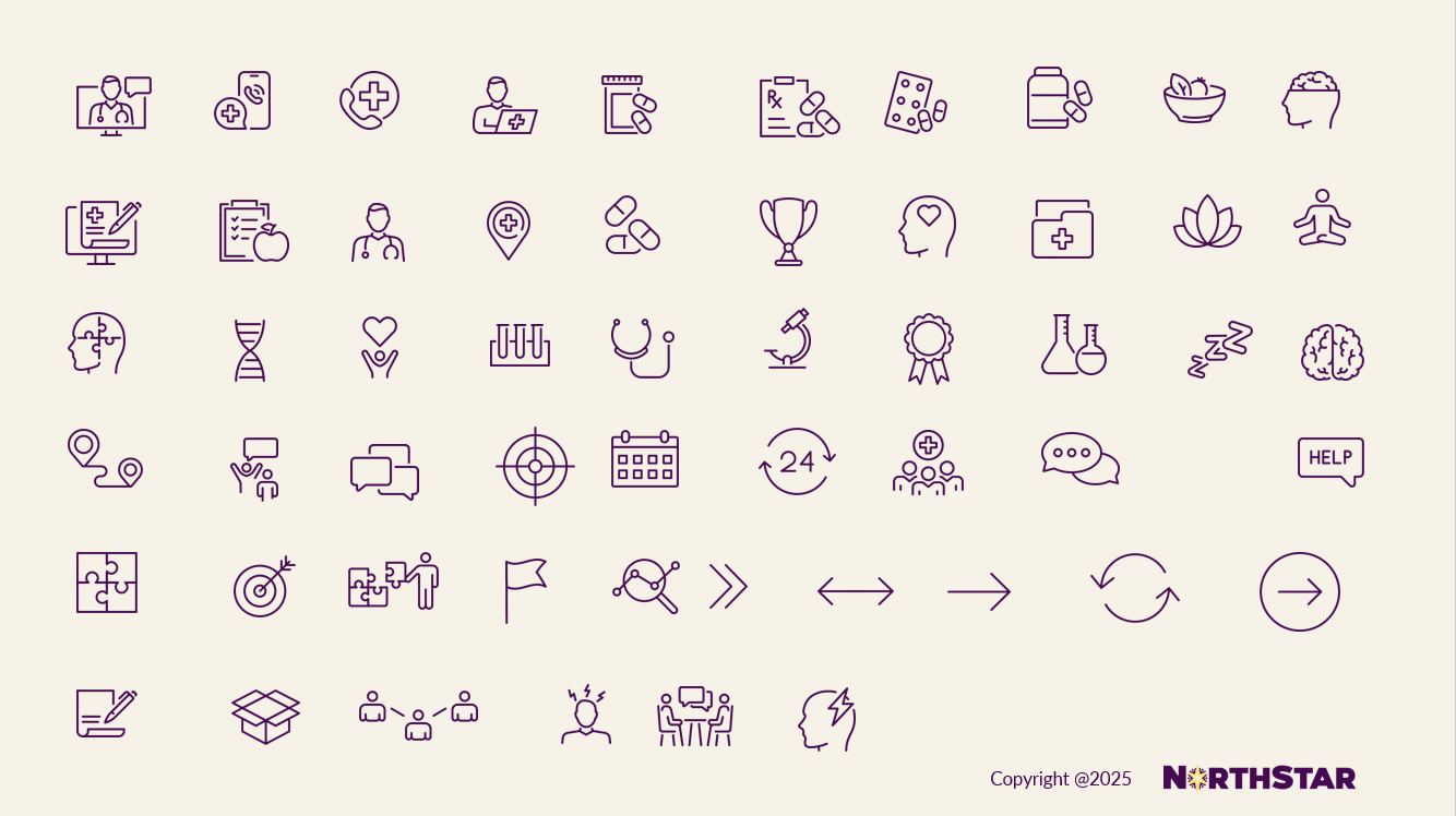
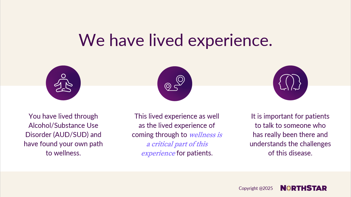
2024-2025 Brand Guide built in Powerpoint
I built a comprehensive brand guide directly within PowerPoint using master slides, layouts, and locked style elements so non-design teams could confidently create and edit materials without breaking the brand system. By embedding typography, color palettes, grid structures, iconography, and pre-approved slide templates into the master file, I ensured visual consistency while allowing flexibility for content updates. This approach reduced dependency on design resources, improved speed to execution, and empowered cross-functional teams to maintain brand integrity at scale.
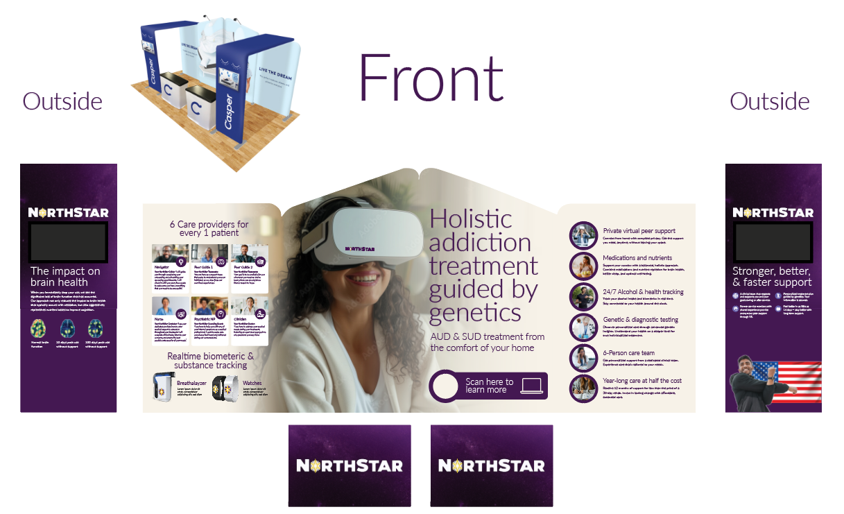
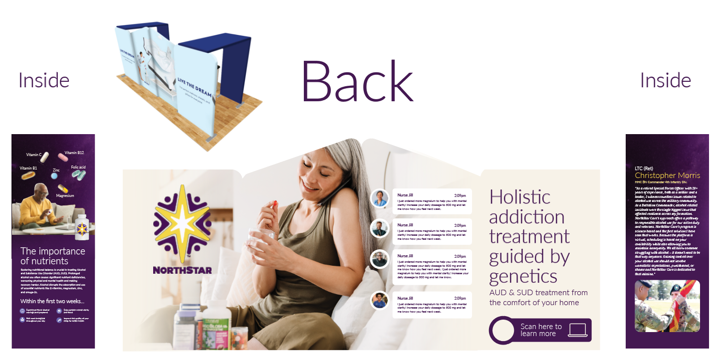
Conference booth
I designed a conference booth experience centered around a bold, large-scale hero image of someone smiling while wearing a VR headset to immediately capture attention on the crowded expo floor. The unexpected, optimistic visual created curiosity and drew attendees in, inviting them to learn more about the technology and its impact. Supporting graphics and concise messaging were intentionally structured to guide the viewer from emotional engagement to key product benefits, creating a clear visual hierarchy that maximized both foot traffic and message retention.
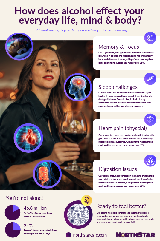
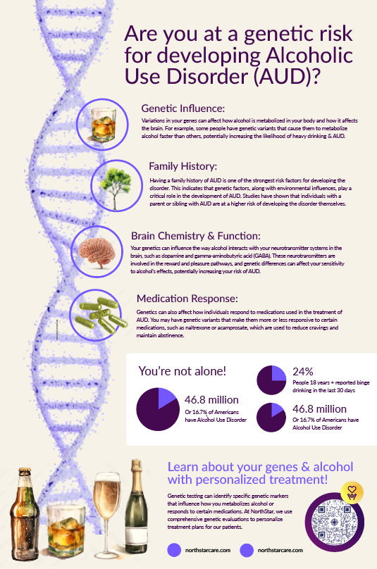
Doctor office posters
I designed a two-part educational poster series for a doctor’s office focused on alcohol awareness and personalized health. The first poster, placed in the waiting room, was created to capture attention and spark curiosity about the broader health effects of alcohol, encouraging patients to engage and learn more.
The second poster, displayed in exam rooms, shifted to a more personalized message—highlighting how genetics can influence alcohol metabolism, tolerance, and health outcomes. Together, the series guided patients from awareness to individualized insight, supporting more informed conversations between providers and patients.
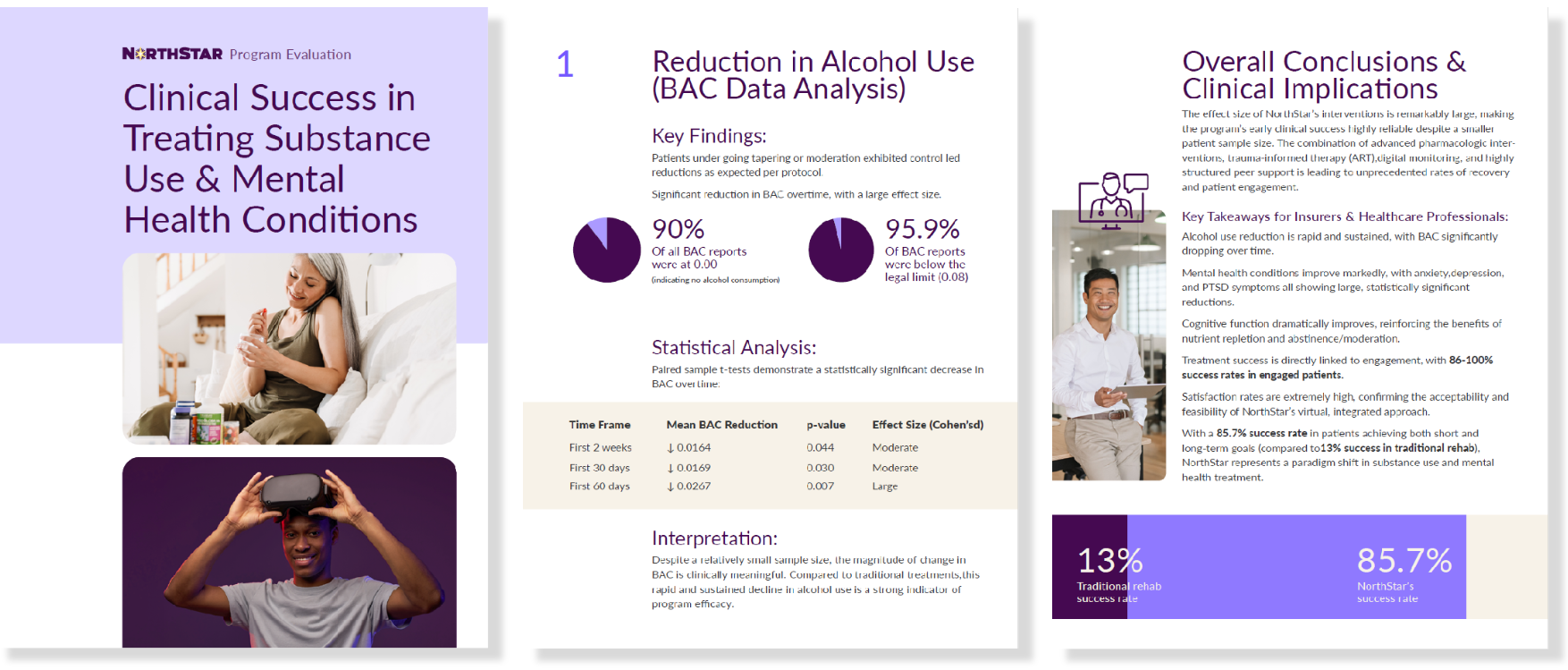
Clinical success white paper
I designed a Clinical Success White Paper aimed at investors and insurance partners. The report evaluated program effectiveness in reducing alcohol use, improving mental health symptoms and cognitive function, and driving strong patient engagement and satisfaction. I translated complex clinical data into clear, executive-level visuals and summaries to communicate measurable outcomes, scalability, and value.
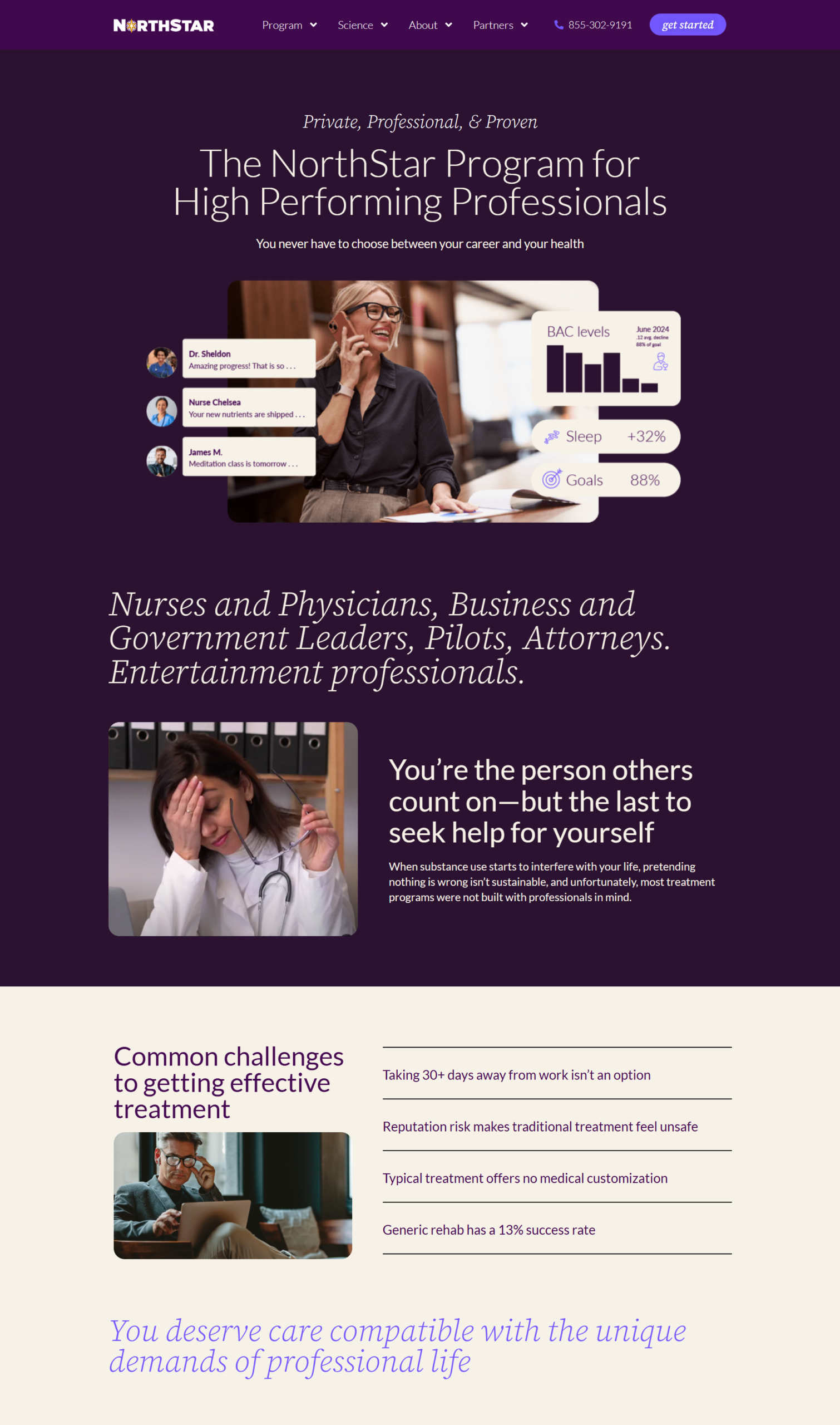
I developed a landing page tailored to high-performing, high-stress professionals looking to reduce their drinking. The design uses darker color tones and professional imagery to create a calm, serious tone that aligns with the audience’s identity and expectations. The goal was to build trust and reduce stigma by presenting the service as a professional wellness solution rather than traditional addiction treatment.
Late 2025-2026 Branding
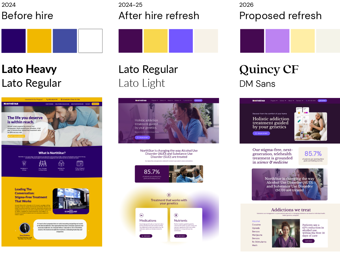
I refreshed the brand’s color palette to include additional mid-tone colors that better supported data visualizations and infographic work. This expanded palette improved flexibility when presenting complex information while maintaining overall brand consistency. I also updated the typography system by introducing a soft, modern serif for headlines to create a more approachable tone, paired with DM Sans for body text. The higher x-height and rounded forms of DM Sans improve readability across digital interfaces while maintaining a clean, contemporary feel.
Meta advertising
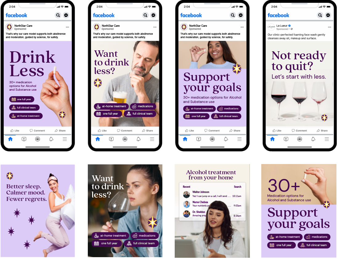
For paid ads, I focused on clear, supportive messaging that emphasized empowerment and positive behavior change. Rather than using fear-based or judgmental language, the creative highlighted achievable progress and personalized support. The visuals and copy were designed to feel approachable and respectful, reducing stigma while encouraging patients to take the next step toward improving their health.
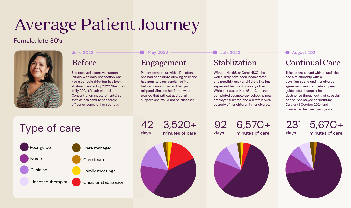
Mapping the patient journey
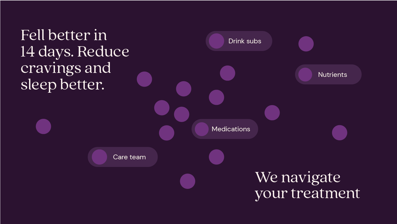
A visual overview of the full patient journey to illustrate how care evolves across different phases of treatment. Using a narrative-based example, the graphic mapped key touchpoints. The visualization clarified what type of care the patient receives at each stage, highlighting clinical interventions, behavioral support, and engagement milestones. This storytelling approach made the care model easy to understand for stakeholders like insurance companies. Added browns to the colors since yellow is not great for developing differentiated shades.
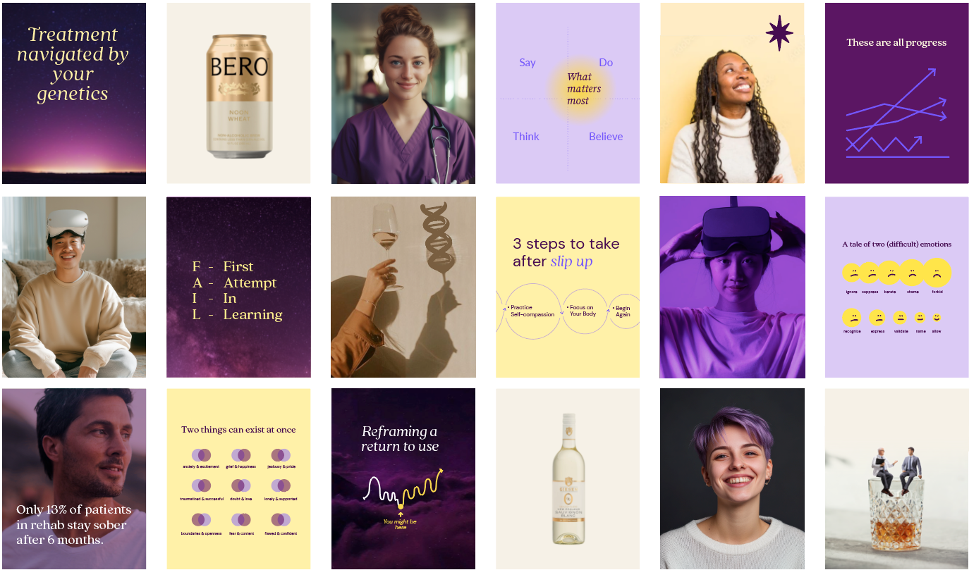
Stima-free Social Media
For social media, I intentionally incorporated stigma-free, empathetic psychographic messaging to reflect patients’ lived experiences rather than labeling them by diagnosis or behavior. Instead of focusing on deficits, the content centered on motivations, challenges, emotional triggers, and personal goals—creating messaging that felt human, supportive, and relatable. This approach helped build trust, reduce shame-based narratives around alcohol use, and position the brand as an ally in behavior change rather than an authority speaking down to patients.
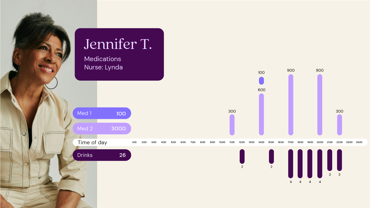
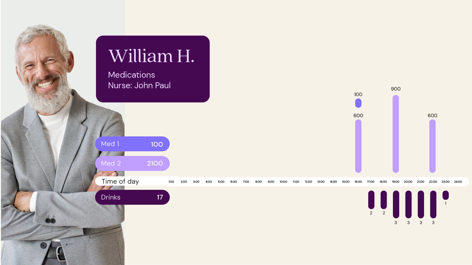
Medication Schedules
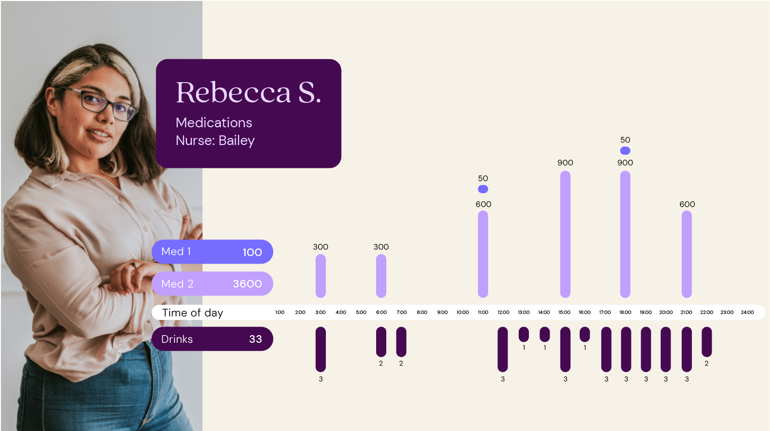
I was provided with raw medication and alcohol-use data and redesigned the Excel sheet to clearly visualize patterns between patients’ normal drinking habits and their prescribed medications. I structured the information so nurses could quickly see overlaps and trends at a glance. This improved clarity, reduced cognitive load, and supported more informed, confident medication administration.
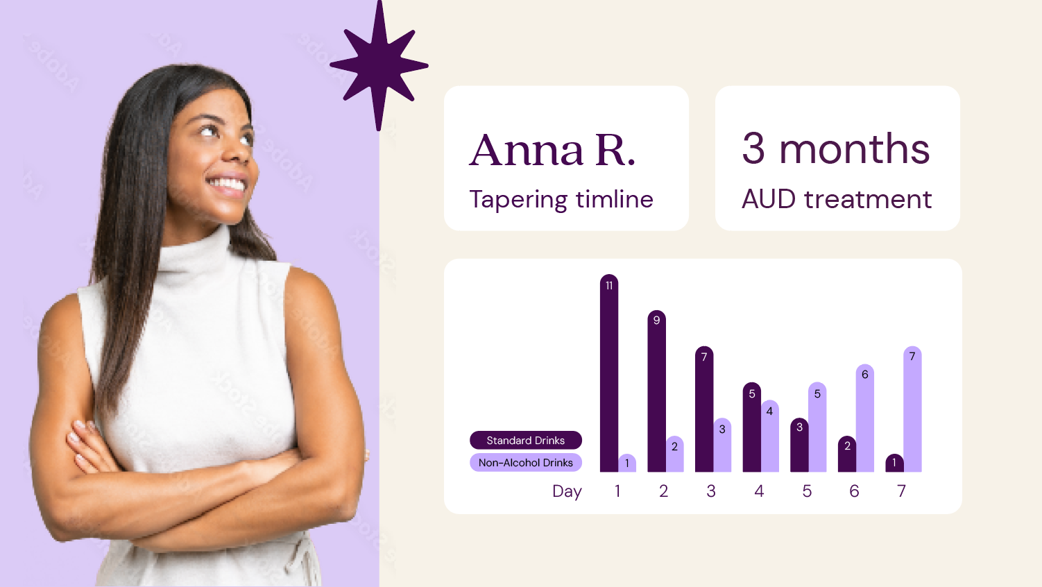
Taper Visualizations
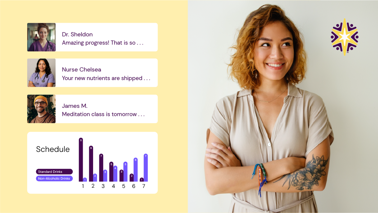
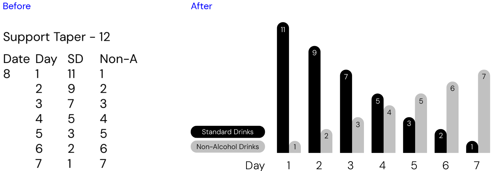
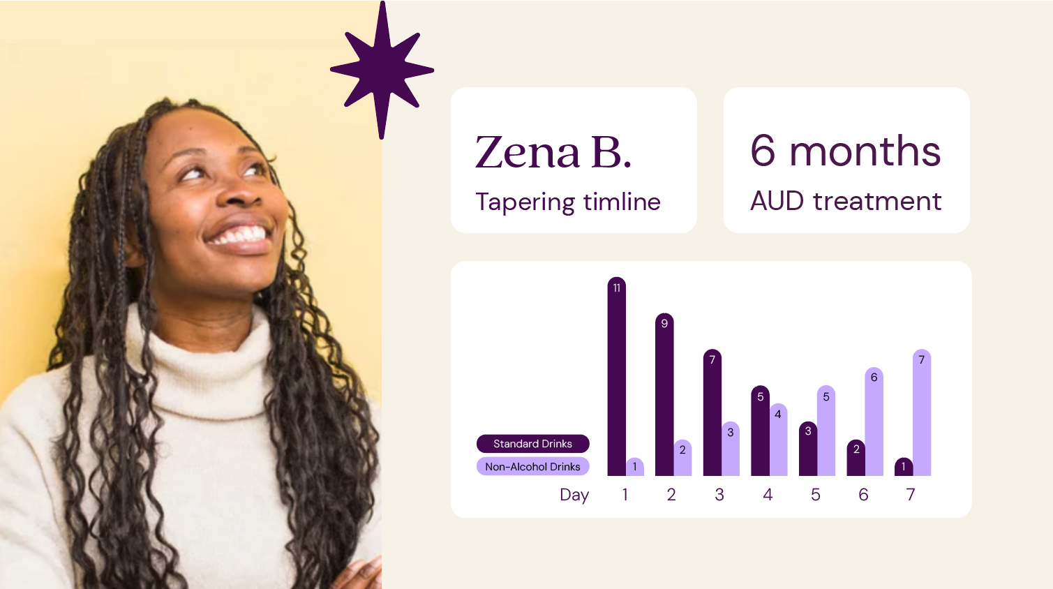
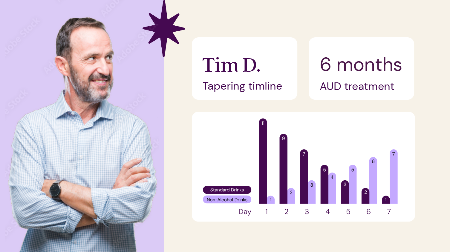
I was provided with an existing Excel file outlining alcohol taper schedules and redesigned it to clearly visualize drinking reduction over time, including substitutions like zero alcohol drinks. Rather than altering the plan, I restructured the data to make daily targets, step-downs, and substitution patterns easy to scan at a glance. This improved clarity for care teams and reduced cognitive load.
Impact
Elevated brand consistency across all channels during high-growth phase
Improved clarity of clinical messaging for patient acquisition and investor materials
Strengthened digital presence through structured, conversion-optimized website design
Increased marketing efficiency through scalable templates and AI-supported workflows
Supported ongoing patient acquisition campaigns with platform-native creative