Power BI (dashboard development, regression analysis)
Tableau (data visualization & storytelling)
Structured healthcare datasets for applied case studies
Transforming the course work into a full brand project
Rather than submitting raw analyses and slide decks, I designed a complete visual system — a fictional hospital brand — that extends across data visualizations, data narratives, and presentation storytelling. The goal was to demonstrate that data doesn’t just inform decisions — it looks, feels, and communicates better when it lives inside a cohesive brand system.
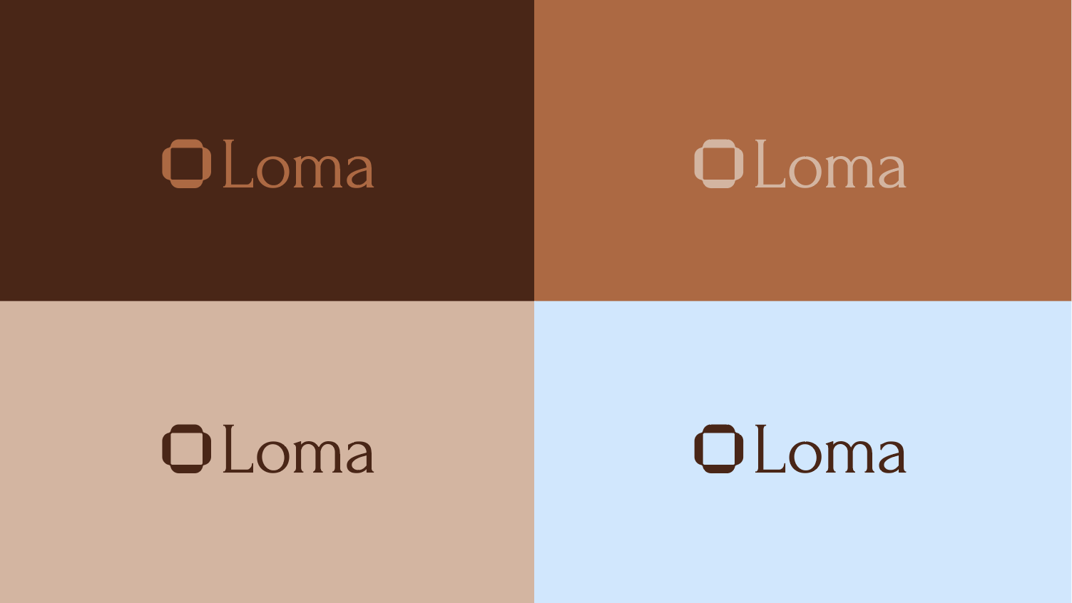
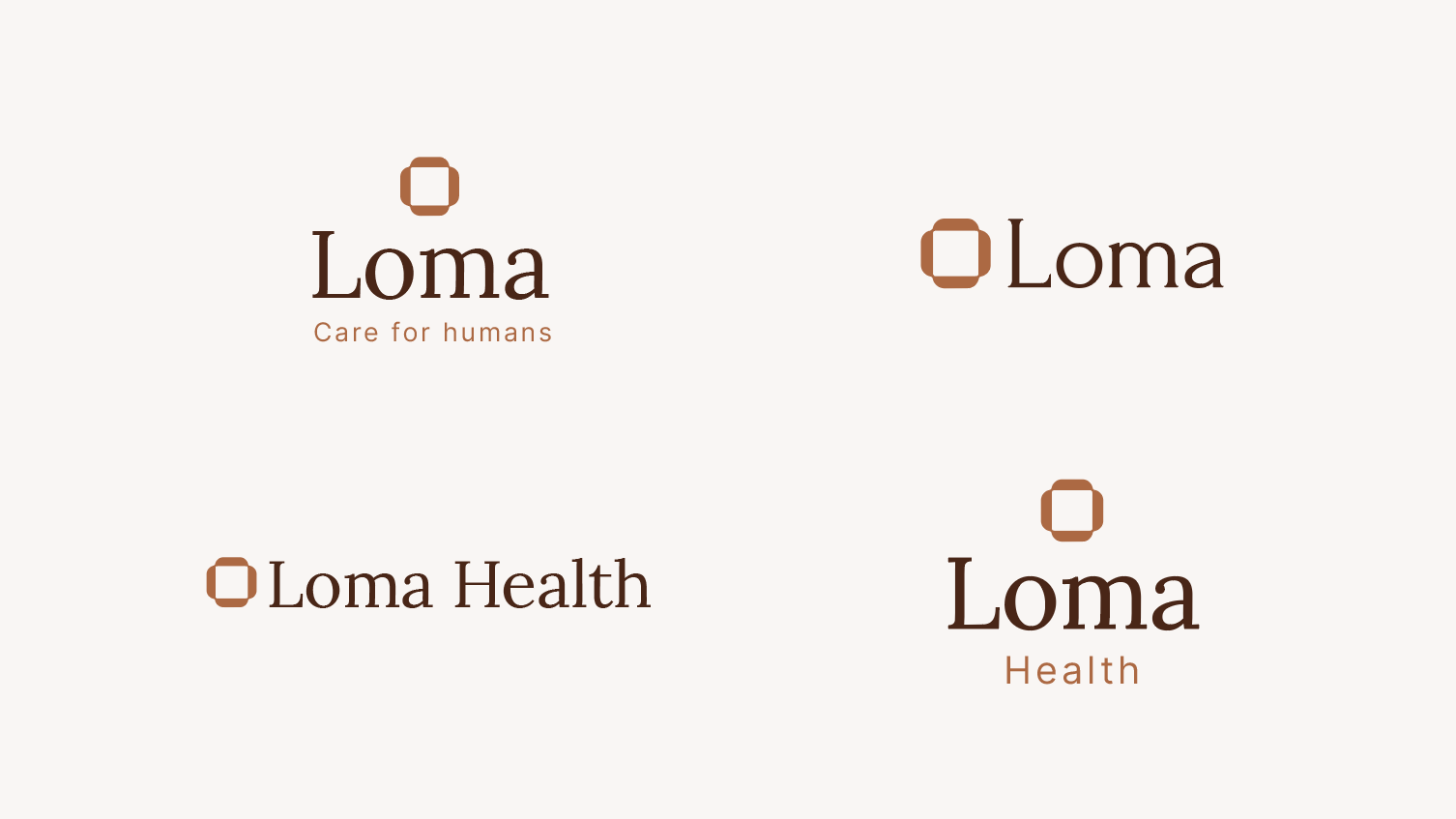
Brand Strategy
Purpose: Steady, lasting healthcare for the Four Corners.
Values: Rooted. Steady. Honest. Connected. Human.
Positioning: Clinical depth with genuine community rootedness — the continuity national chains can’t offer, with the scale standalone facilities can’t match.
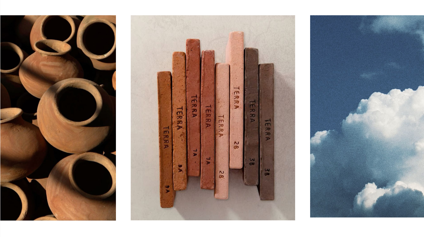
Real people, real places. Four Corners landscapes and textures.
Typography:
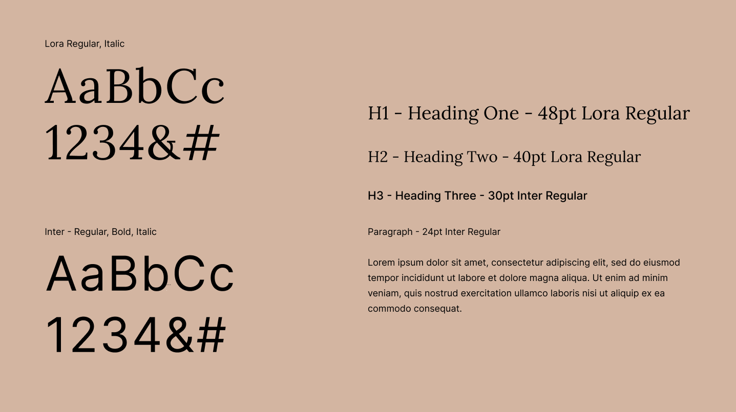
Lora for a humanistic, friendly, and warm feel in headers, adding an approachable and reassuring personality that balances professionalism with a more conversational, reader-centered tone. Inter for body and data visualizations. Inter is a Tabular font where the numbers are designed with identical character widths, ensuring vertical alignment in columns, tables, financial reports, spreadsheets, and menus.
How the Brand Extends to Data
This is the core of the project. The brand isn’t just a logo — it’s a system that governs how data is presented and how narratives are told.
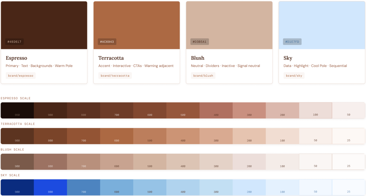
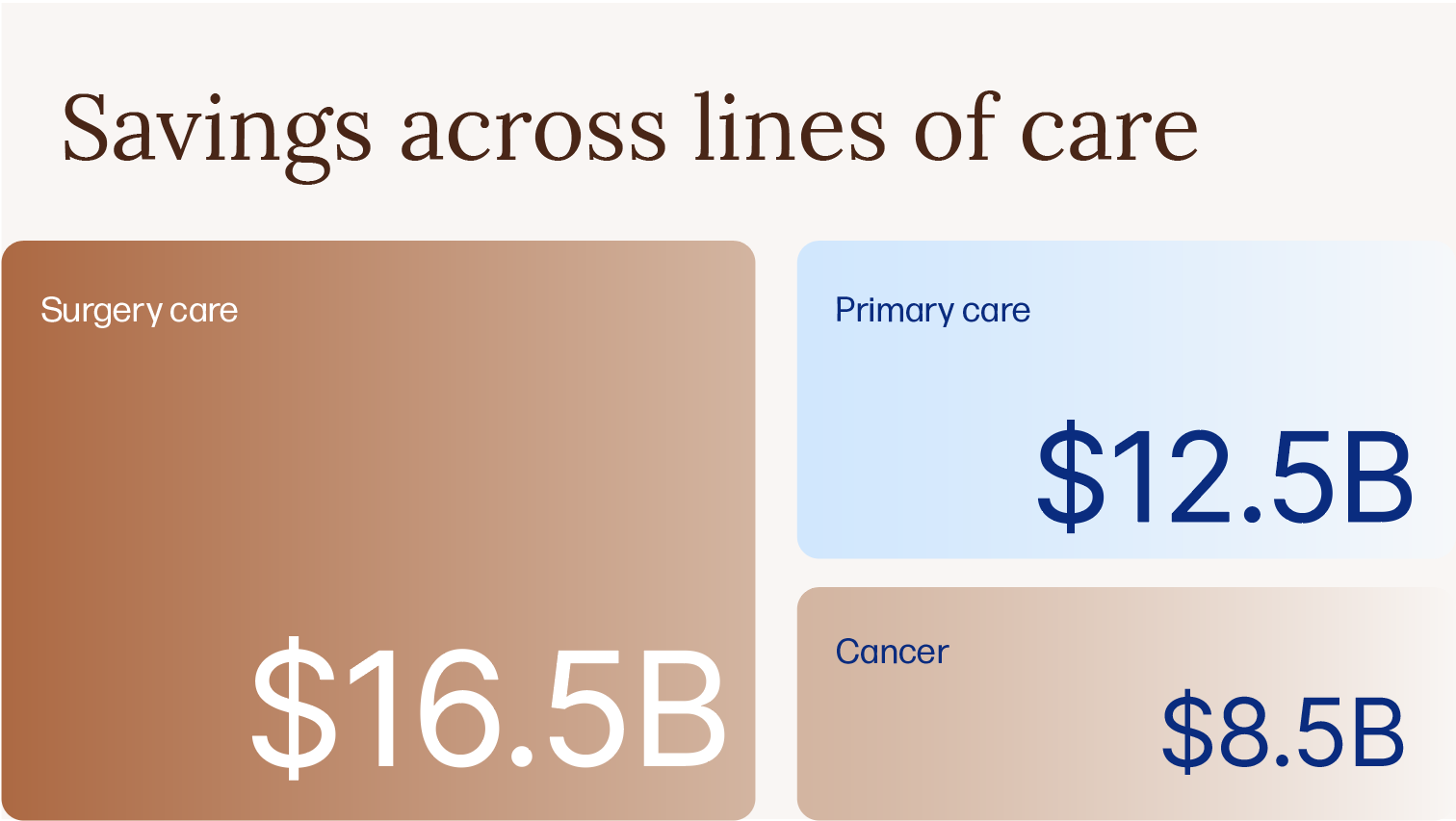
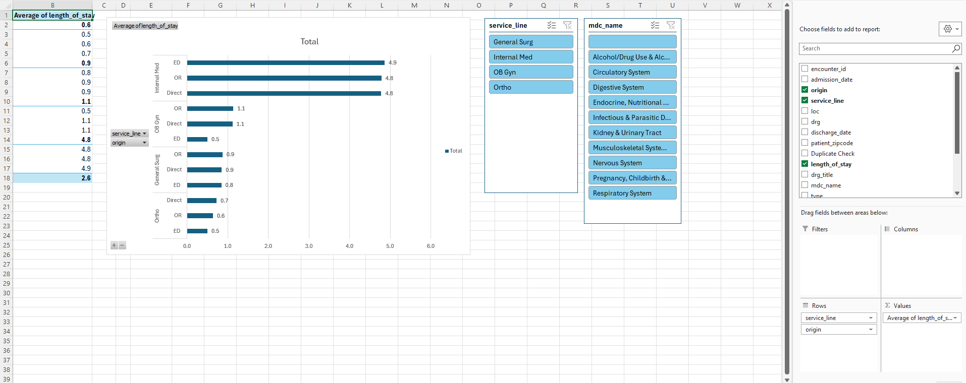
Data visualizations — Every chart uses the Loma Health color system, typography, and layout standards. Attrition data, patient outcomes, length of stay comparisons, regression analyses — all branded consistently.
Data narratives — The brand voice carries into how findings are written. Direct, human, jargon-free. Data tells a story about real people, not abstract metrics.
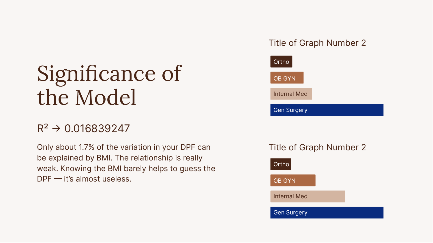
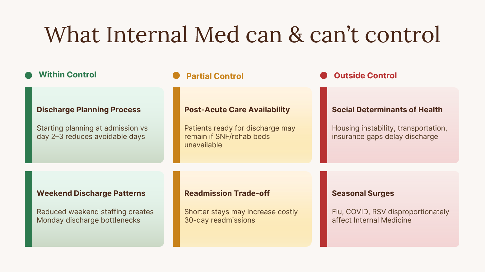
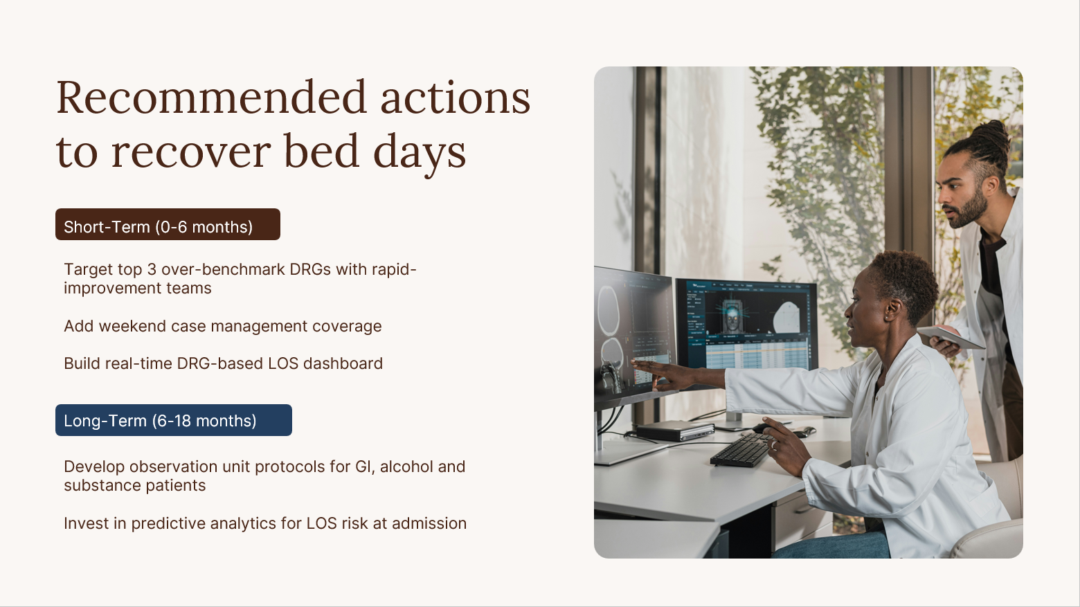
Presentation storytelling — Slide decks follow the brand system. A presentation to the CMO about resource utilization looks like it came from the same organization as a patient-facing brochure.
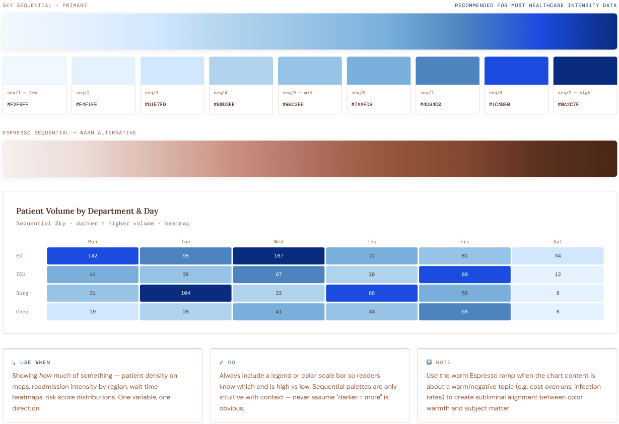
Single-Direction Intensity
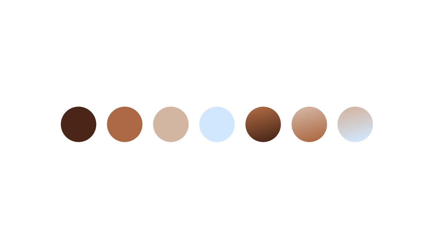
For data with a natural low-to-high order. Lighter = less, darker = more. Your Sky blue family makes a stunning sequential ramp — it’s the data visualization signature of this brand.
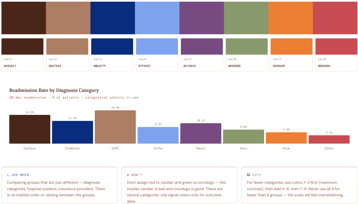
Qualitative Colors
8 colors for comparing distinct, unordered groups. Maximum perceptual differentiation — hue, lightness, and saturation all vary so no two bars look alike even at small sizes.
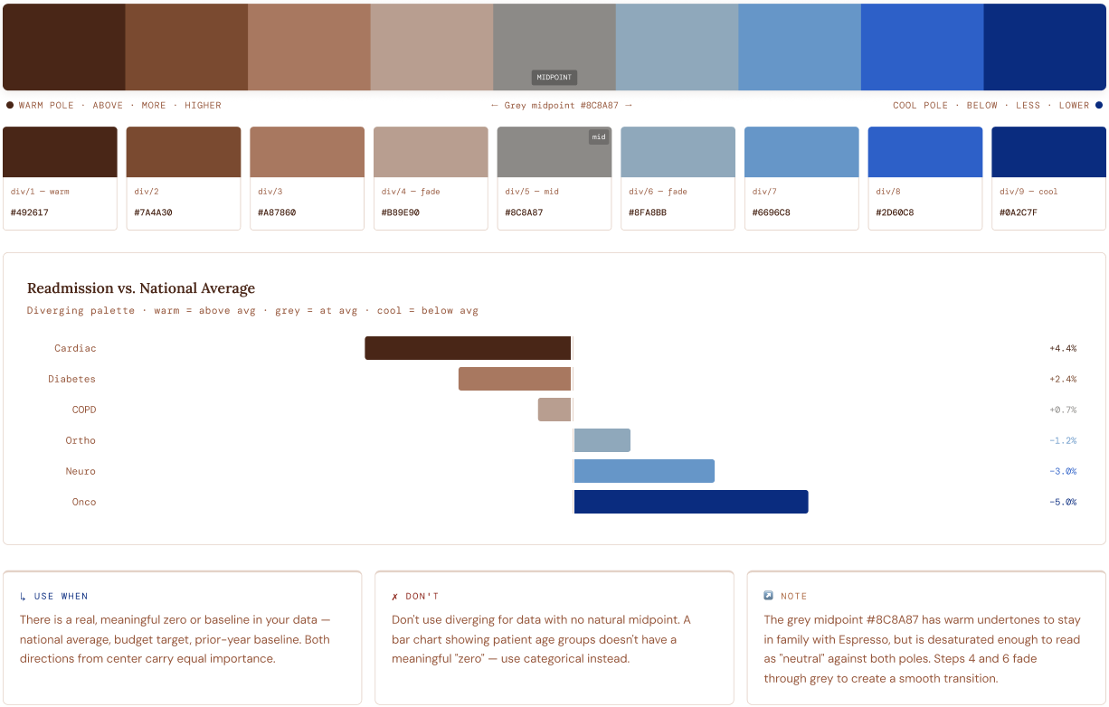
Two Poles · Grey Midpoint
For data with a meaningful center — above/below baseline, year-over-year change, deviation from benchmark. Warm pole = above/high/more. Cool pole = below/low/less. Warm grey midpoint sits cleanly between both poles with a smooth, desaturated transition.
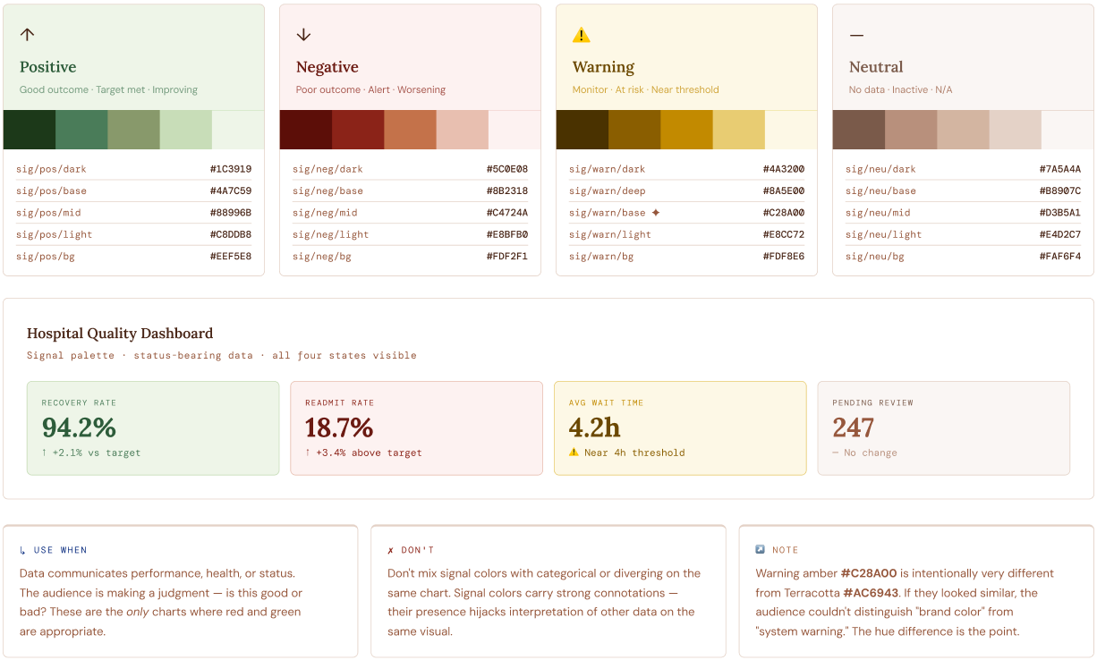
Status & Alert Colors
For data that carries moral weight — outcomes, targets, risk scores. Universally understood green/amber/red conventions tuned to harmonize with your warm palette. Warning is a bold amber-gold, distinctly different from Terracotta brand color.
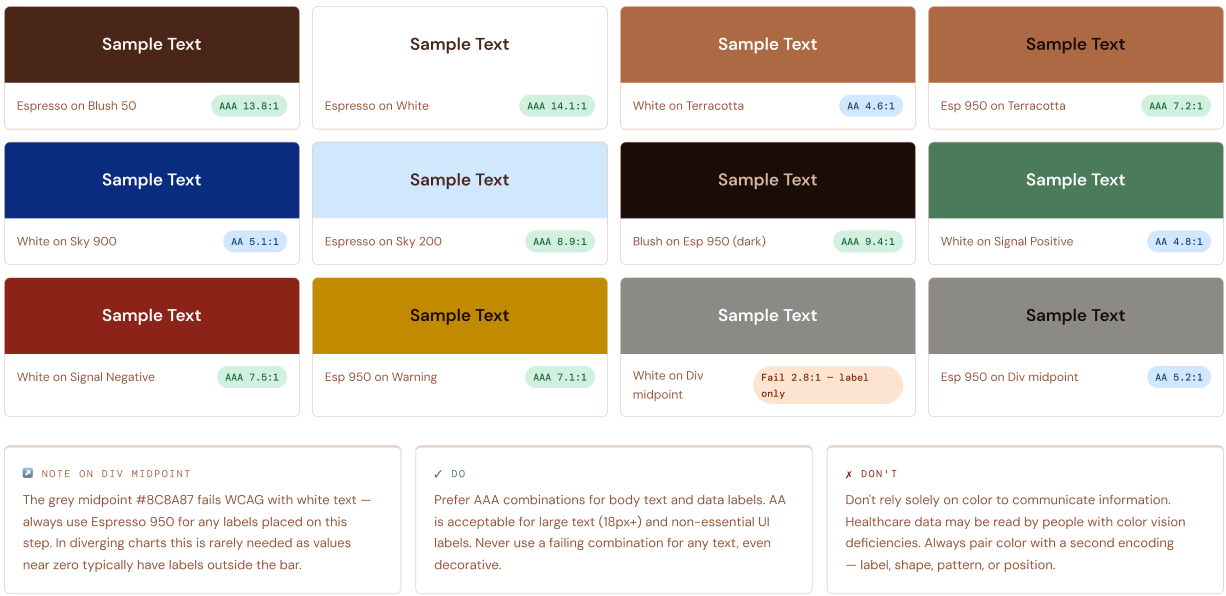
WCAG Contrast Checks
All primary text, interactive, and signal color combinations verified against WCAG 2.1. AA required (4.5:1 for normal text). AAA enhanced (7:1). Healthcare data is often consumed under stress — accessibility is not optional.
Class Assignment
the task:
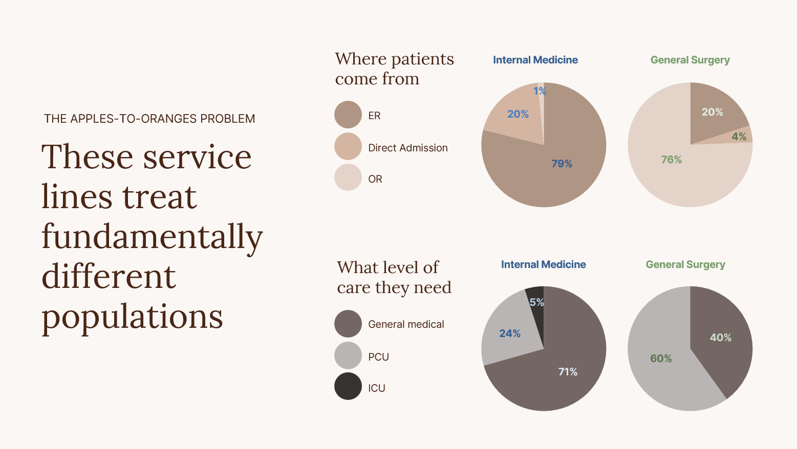
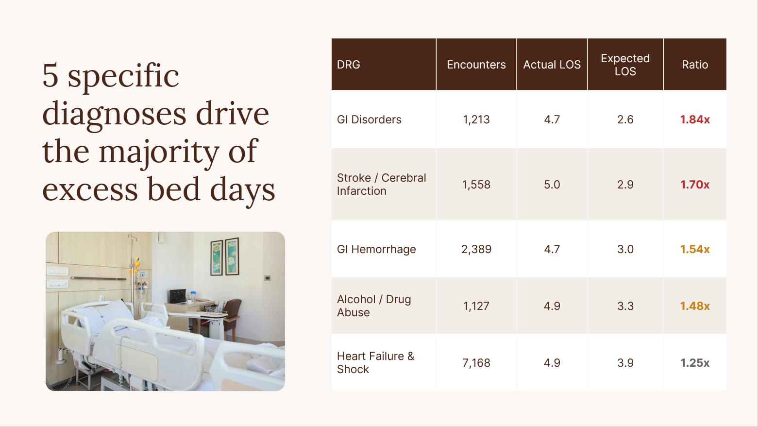
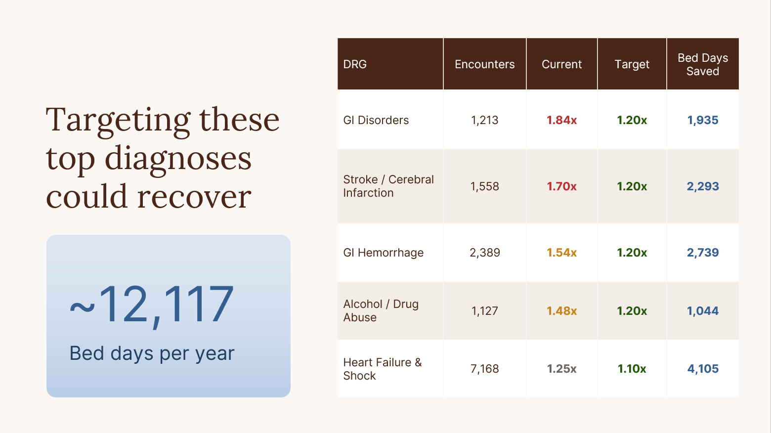
Analyzed hospital patient length of stay data to settle an internal dispute between General Medicine and General Surgery over bed utilization. The project required pulling descriptive statistics and building visualizations to determine whether General Medicine’s longer stays reflected poor performance or a more complex patient population. Findings were translated into a concise 5-slide PowerPoint with data-driven recommendations for both short and long-term bed management strategies — practicing the full pipeline from raw data analysis to executive-ready presentation design.
Using Claude to visualize a descriptive dashboard
Hospital encounter analytics
Encounter & Length of Stay Dashboard
97,435 encounters across General Surgery, Internal Medicine, OB Gyn, and Orthopedics
Total encounters
97,435
2-year period
Avg length of stay
2.63
days, all service lines
Int. Med over expected
39.9%
highest of any line
Service lines
4
Surg · Med · OB · Ortho
Monthly encounter volume by service line
Stacked totals across all 24 months. Hover to see individual service line counts.
Internal MedOB GynGeneral SurgOrtho
Key insight: Internal Med accounts for ~44% of all encounters and shows a consistent January surge — a seasonal pattern worth tracking for capacity planning.
Actual vs CMS expected length of stay by service line
Geometric mean LOS is the CMS DRG benchmark. Bars exceeding benchmark indicate throughput pressure.
Actual LOS (days)Expected LOS (days)
Internal Med is the only service line exceeding benchmark — 4.85 days actual vs 4.32 expected +0.53 over. All others perform well under benchmark under.
Percentage of encounters exceeding expected LOS
Broken down by patient origin — Emergency Dept, Direct admission, or Operating Room.
DirectEDOR
Internal Med ED patients have the highest over-expected rate at 40.1%. OB Gyn ED shows 0% — those are typically brief stabilization visits.
Internal Medicine — actual vs expected LOS by diagnosis category
Major Diagnostic Categories for Internal Med only. Hover for encounter counts.
Actual LOSExpected LOS
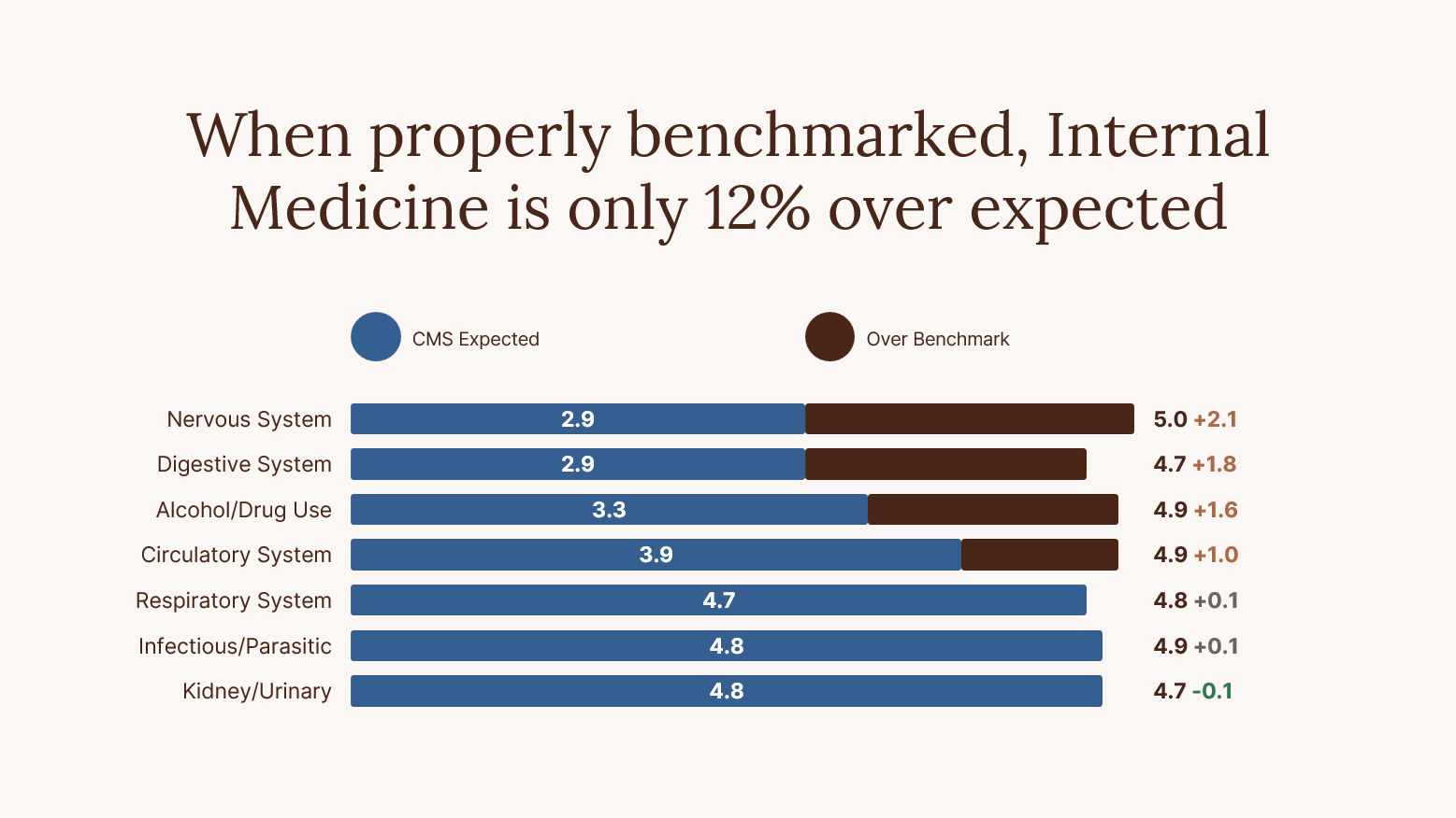
Nervous System has the largest gap — 4.95 days actual vs 2.90 expected, a +2.05 day overage. Kidney & Urinary Tract is the only MDC where actual LOS is under benchmark.
Using Claude PowerPoint agent + Claude Skills
ROUND ONE
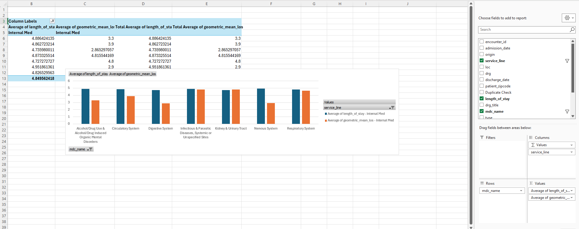
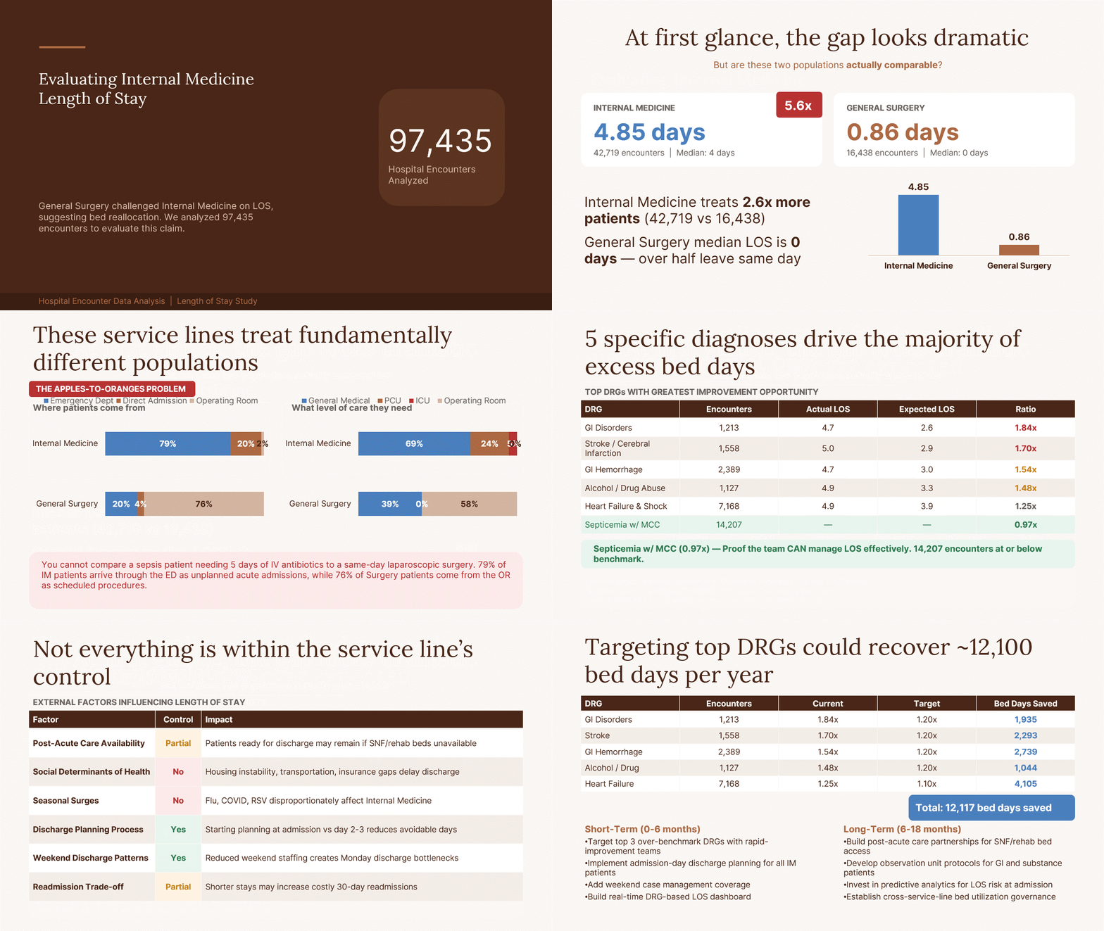
Opened the Claude PowerPoint agent and prompted it to reference the Loma Health Brand Skill before making any design decisions.
Claude pulled the correct hex codes, font pairings, and chart formatting rules directly from the skill — no manual input needed.
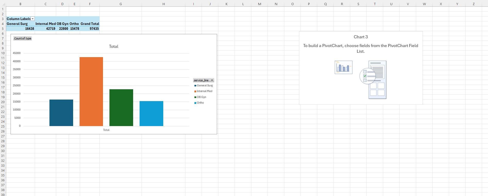
Imported Excel pivot tables and charts into PowerPoint, with colors and typography applied automatically from the skill.
First pass confirmed the Brand Skill works as a live reference inside the agent — design decisions happened automatically without back-and-forth correction.
ROUND TWO
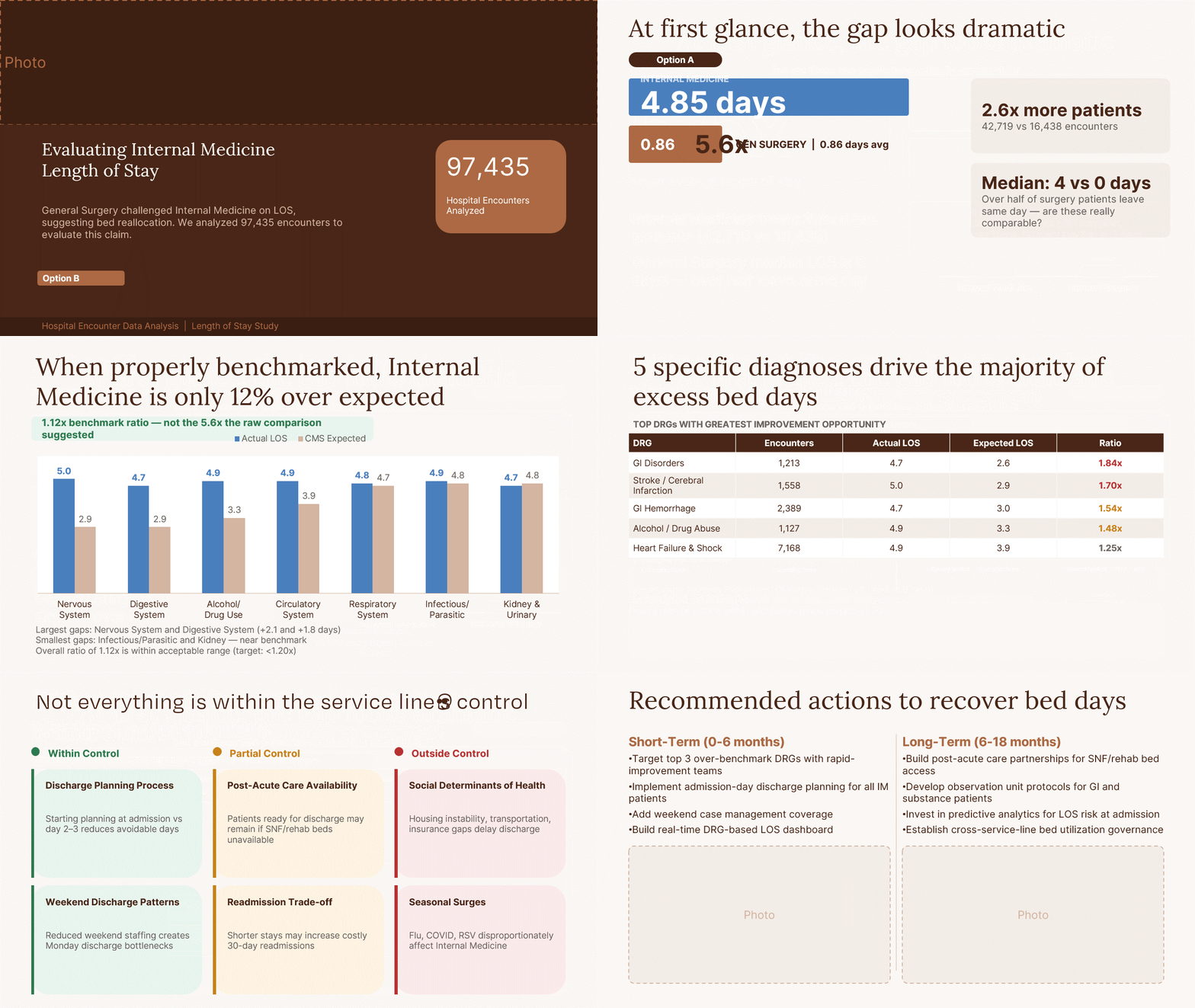
Uploaded layout references into the Claude PowerPoint agent to guide slide structure and spacing decisions.
Claude referenced the Hale Health Brand Skill to apply the correct colors, typography, and chart formatting to the imported visuals.
Reviewed the visualizations and gave feedback on spacing, alignment, and how the data was being presented.
Claude adjusted the layouts based on feedback, tightening spacing and refining the chart presentation to better match the brand system.
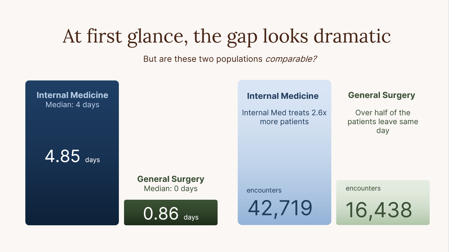
Final presenation
After the second round, I was unable to advance Claude’s progress further, so I took over and completed the remaining details, including incorporating photos and refining the visualizations.